One of the projects we’ve been working on at Kickserv is an email marketing and engagement application. A key piece to the customer experience is setting up email campaigns.
Email Creation Form
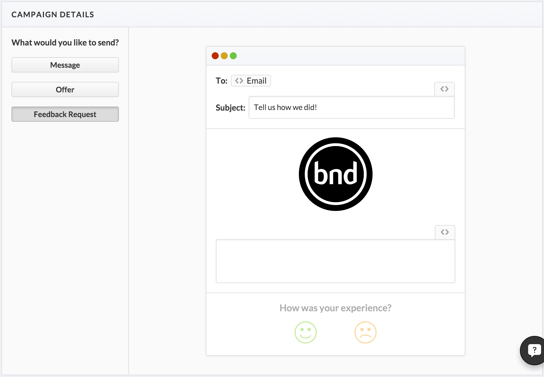
After some back and forth with customers, we found that providing them with a “psuedo-WYSIWYG” interface resulted in the best outcome. We designed the content creation form to mimic the display of the emails as they’d be seen by the recipient.
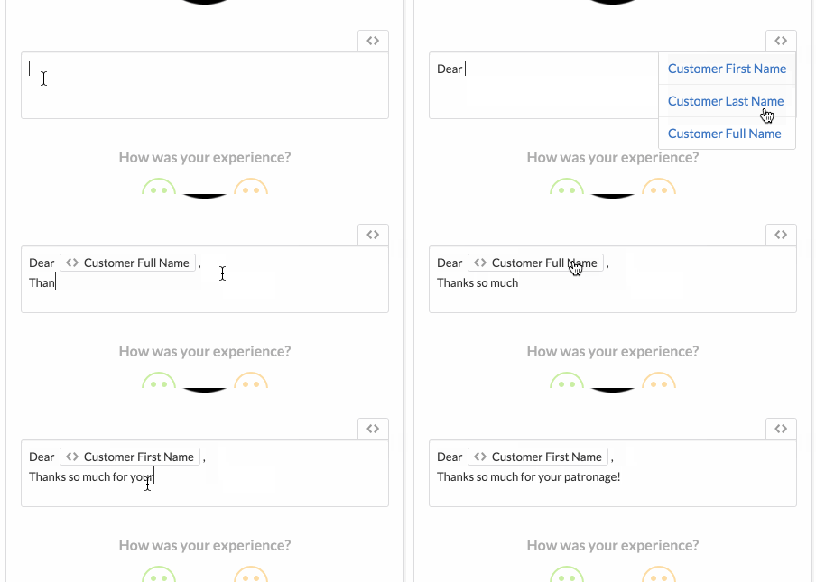
One of the features that seemed really simple in the early stages of the design process was our Merge Tags, which provides the user a simple way to include variable data in their emails. We wanted to show users the data they could use visually, instead of forcing them to use an obscure code or set of special brackets, like [[customer_first_name]]. This didn’t seem incredibly friendly to us.
So, our front end master Josh worked some magic with contenteditable and we implemented a design that has been received quite well so far.
Contact Info & Activity
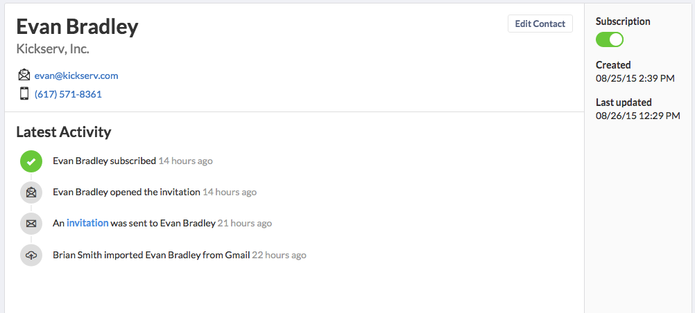
Another key part of this application is a single contact’s profile page. Because we are dealing with email contacts, we don’t know a lot of fancy information about them. But we do know the most important information about a contact: the actions they’ve completed.
So, our goal on this page was to create a straightforward presentation of the essential contact information and a visually interesting activity feed that highlights the important milestones a contact might reach (subscribing, claiming an offer, writing a review, etc.).


